Helvetica: one font to rule them all; For the past 50 years Helvetica has dominated design. But, now its pioneer Mike Parker has passed away, is the era of this sleek, modernist typeface drawing to a close?
March 11, 2014 Leave a comment
Helvetica: one font to rule them all
For the past 50 years Helvetica has dominated design. But, now its pioneer Mike Parker has passed away, is the era of this sleek, modernist typeface drawing to a close?
The Guardian, Tuesday 4 March 2014 19.00 GMT
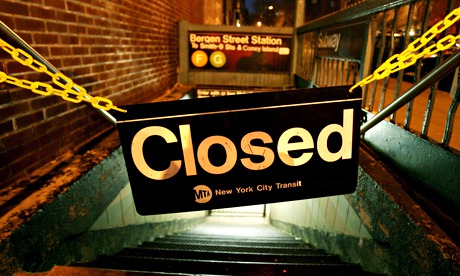
Helvetica can be seen on the New York subway system and in countless other instantly recognisable logos. Photograph: Justin Lane/EPA
One of the few places the Helvetica font has failed to infiltrate over the past half-century is the graveyard – Roman typefaces such as Perpetua or Bembo tend to work better on headstones. But perhaps now is the time to put it there. The recent death of Mike Parker, often labelled “the godfather of fonts”, brings with it the delicate question of whether or not his most famous work should join him.
Today the Helvetica font is ubiquitous, used to spell out major brand identities (Nestlé, Lufthansa, Toyota, American Airlines), shop names (American Apparel, Gap), public signage (the New York subway system was an early adopter), tech companies (Microsoft, Intel, Apple – current iPhones use the fashionably skinny Helvetica Neue) and self-defeatingly ironic T-shirt slogans (“I hate Helvetica”).
As the name implies, Helvetica’s roots were Swiss (originally it was called Neue Haas Grotesk, which sounds more like a 1980s German industrial band). It was developed in 1956 by Max Miedinger and Eduard Hoffman, very much in sympathy with the new Swiss Style – which treated graphic design almost as a postwar utopian mission. Just as modernist architecture stripped away superfluous building ornamentation, so the new Swiss typography snipped off the frivolous serifs – relics from an older era of print technology, namely stone carving. Now we were in the modern, industrial era where fast, clear communication was key.
 The modern lines of the font are used by airlines such as American and Lufthansa. Photograph: Alamy
Parker, a British-born American, was in the right place at the the right time to smooth its serif-free passage to global dominion. The place was the Mergenthaler Linotype Company of the US, where he became director in 1961. The company’s Linotype machines were the industry standard in news and book printing, and they supplied the typefaces. Parker is estimated to have popularised over 1,000 of them but Helvetica was the one that took off. Parker describes it as “a landslide waiting to go down the mountain”.
In 1960s America, the new discipline of corporate identity consultancy used Helvetica like a high-pressure hose, blasting away the preceding decades of cursive scripts, pictorial logos, excitable exclamation marks and general typographical chaos, and leaving in its place a world of cool, factual understatement. The font itself said as much as what was written in it – which, pretty soon, was everything.
American Apparel has also adopted the typeface for its corporate identity. Photograph: Mario Anzuoni/REUTERS
But is its reign drawing to a close? Helvetica is now so ubiquitous, it barely says anything any more. Besides which, many of the qualities Helvetica was once associated with aren’t quite as enthralling as they were: corporate dominance, machine-like indifference, bland conformity, American Apparel ads. Talk to a graphic designer today and they will often admit an intense dislike of Helvetica. Purists have sought to reinstate the original Neue Haas Grotesk, restoring almost imperceptible details lost in Helvetica’s digital format. Others seeking an anti-Helvetica have settled on the childish Comic Sans. Professionals love Comic Sans like a vampire loves garlic, which could explain why it’s become the default type for goofy internet memes. There’s been a noticeable growth in Avenir-type fonts in new London stores – possibly influenced by the Keep Calm And Carry On poster. Even Wes Anderson has ditched his beloved Futura (a sans-serif font easily confused with Helvetica) in favour of busier, pre-modernist fonts like Archer Bold.
To veterans like Parker, though, who appreciated the nuances of type in ways few people can fathom, Helvetica was an all-time classic. “What it’s all about is the interrelationship of the negative shape – the figure-ground relationship, the shapes between characters and within characters,” Parker explained in Gary Hustwit’s 2007 documentary, Helvetica. Its letters live “in a powerful matrix of surrounding space,” Parker continued, almost at a loss for words. “It’s … Oh, it’s brilliant when it’s done well.” They could put that on his gravestone.
• The picture at the top of this article was replaced on 5 March 2014 as the original image showed an old New York subway sign that used a previous font, not Helvetica.

